


Opposites Attract
- Jun 21, 2018
- 2 min read

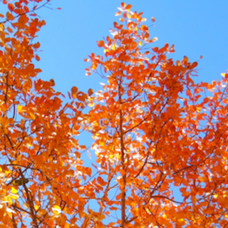
Blue and Orange. Red and Green. Purple and Yellow. These combinations are known in the color theory world as complementary colors. Also known as opposites since they fall opposite each other on the color wheel. Using them together heightens the brightness of both colors. Using complementary colors is more common than you might think once you start noticing them. Nature is full of them and they are common practice in famous works of art, graphic design and business logos.


In art and nature these colors work together. The same goes for interior design.
No way, you say! Yes way, I say! Start looking around you - athletic shoes, pottery, fabric prints, quilts, nature, your garden, fine art. It's not just the primary colors. There is a spectrum, or scale, of graded colors as the mix together. You'll find your style in there somewhere. I don't want to go too much into color theory, but when you mix complementary colors together you basically get gray. Color theorists would say blue and orange mixed together gets you a purple undertone shade of gray. Now gray becomes your neutral in the room. This brings me to another topic that there is no pure gray. I say this to clients all the time. They tell me they just want a basic gray. Actually that does not exist. All grays have an undertone because gray is the mixture of colors - not black and white.


There's an app for that! It's called I Love Hue. Yes, I play it often. I'm not into word games so much, but color games catch my eye. Try it! You'll like it! Mikey does.
Images:
- color wheel, coleus, orange tree in blue sky all from springleafstudios.com
- 3 rows of mixing complementary colors by Jane Cozart, Instructor of Color Theory, Academy of Art University
Comments